Green Housing Study: Data Shirts, BigBarChart, and Dressed in Data
with MIT undergraduates Phoebe Cai, Amber Guo, Kristin Zimmerman, Katherine Paseman, and Dayanna Espinoza Silva; Silent Spring Institute; and Harvard University
In this project, we design data physicalizations for participants in the The Green Housing Study. This environmental health study measured chemical levels and allergens in homes with a child impacted by asthma in public housing throughout the country, including sites in Boston. More information is available in our publications:
- Perovich, L.J., P. Cai, A. Guo, K. Zimmerman, K. Paseman, D. Espinoza Silva, J.B. Brody. Data Clothing and BigBarChart: Designing Physical Data Reports on Indoor Pollutants for Individuals and Communities. IEEE Computer Graphics and Applications, 41(1), p. 87-98. January/February 2021.
- Perovich, L.J., J.L. Ohayon, E.M. Cousins, R. Morello-Frosch, P. Brown, G. Adamkiewicz, J.G. Brody. Reporting to parents on children’s exposures to asthma triggers in low-income and public housing, an interview-based case study of ethics, environmental literacy, individual action, and public health benefits. Environmental Health, 17:48, 2018.
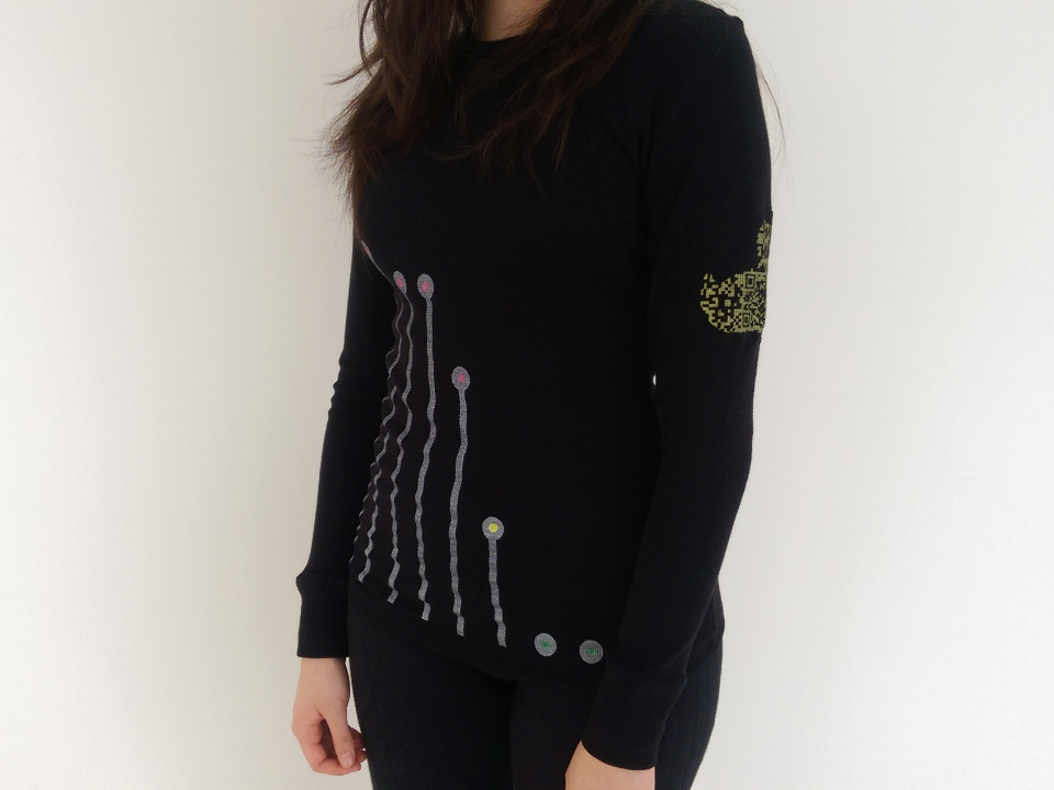
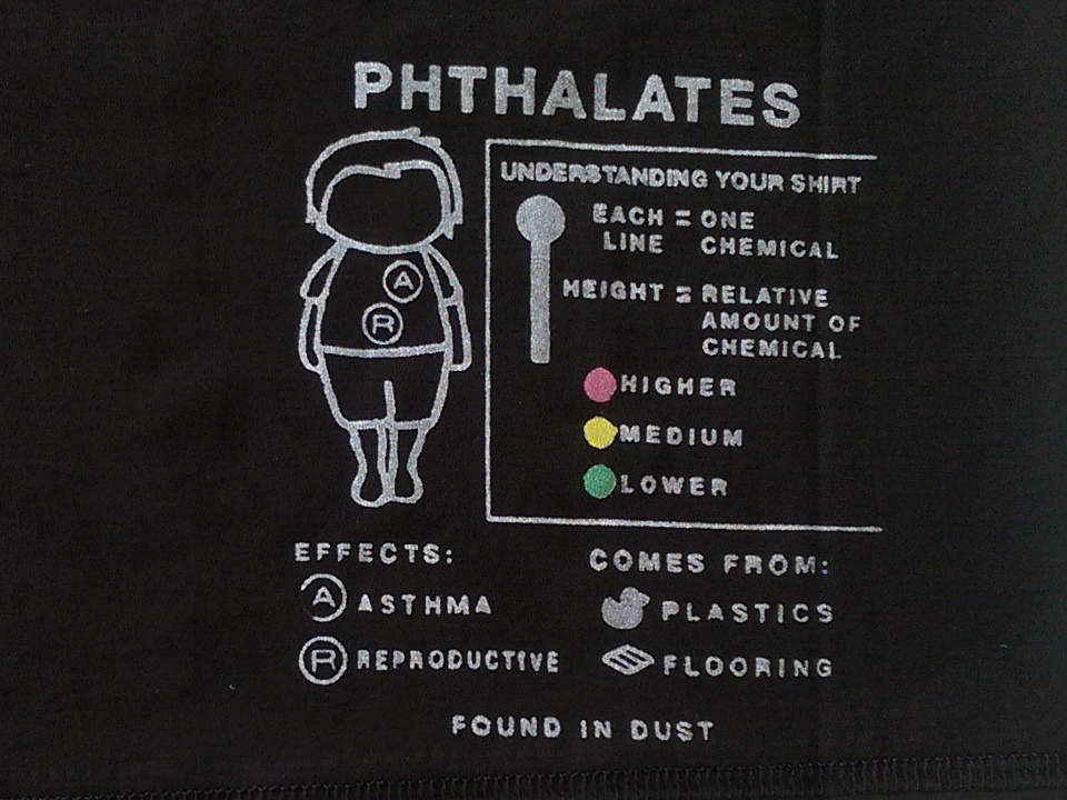
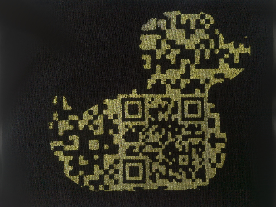
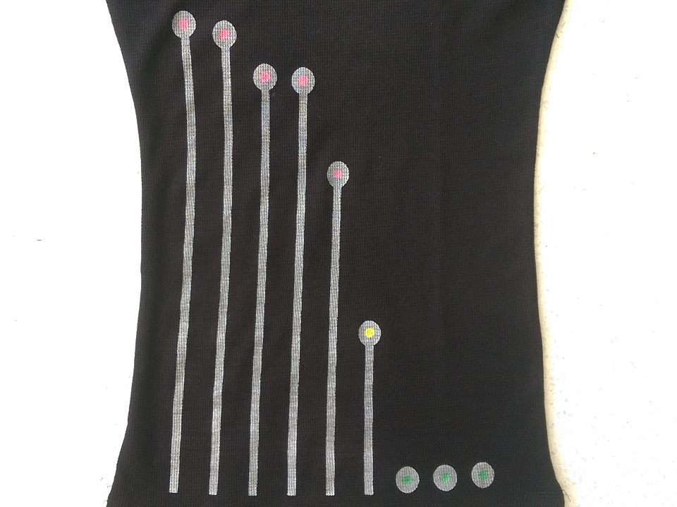
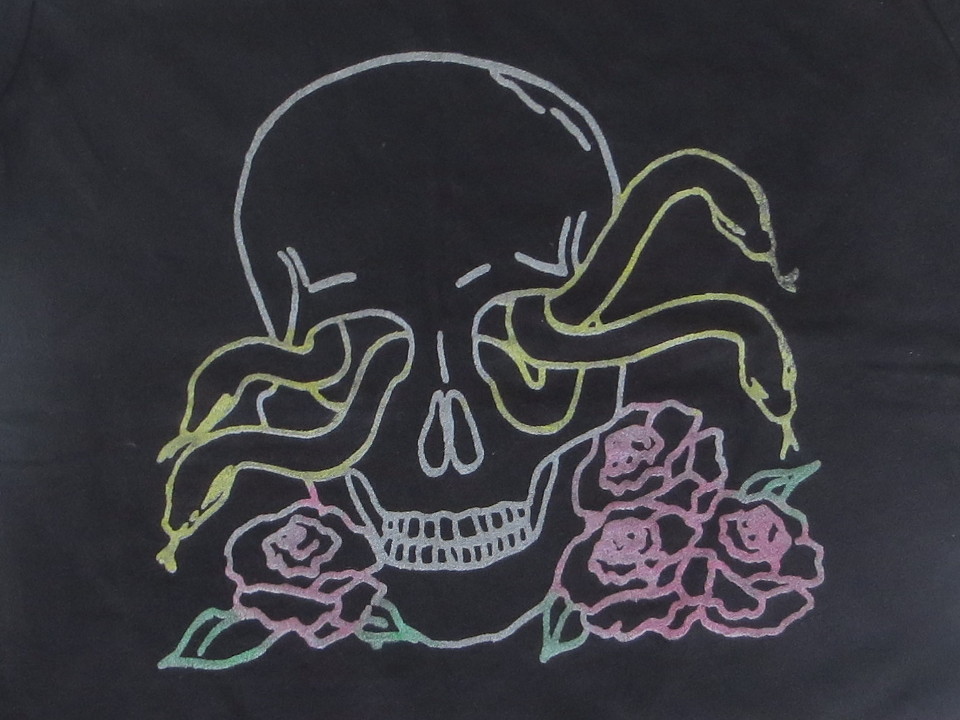
For the first data physicalization, Data Shirts, we designed and created personalized data shirts for Boston participants that they received at community meetings with their paper-based results report. We created three initial shirt designs that displayed the amount of phthalates (nine chemicals) found in dust. Some designs were closely related to traditional graphs (line-circle) while others were more artistic and abstracted (skull). The line-circle design was ultimately selected based on user testing of designs with residents of the study housing development.
The line-circle design is based on a traditional bar graph. Each line represents one phthalate measured in the participant's dust. The height of the line indicates the relative amount of that phthalate found compared to other people in the study (i.e. the participant's percentile). A red (high), yellow (middle), or green (low) circle on top of the line indicates the participant's tertile for that chemical. Chemicals are sorted in descending order of percentile to provide visual clarity. The shirts also included meta-information to aid user comprehension. A shirt tag lists sources and health effects of phthalates. A duck-shaped QR code on the sleeve links to detailed information on the study and the chemicals, as well as providing an opportunity to contact researchers.
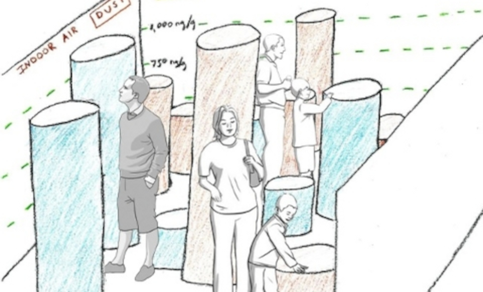
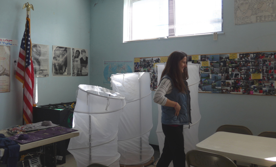
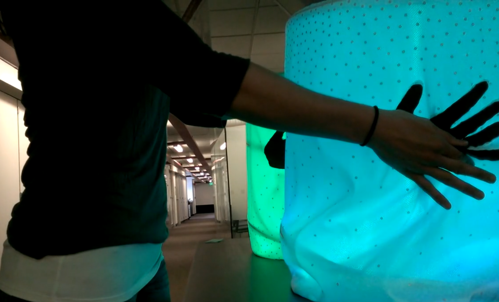
The second data physicalization, BigBarChart, aimed to create a physical way for a group of people to interact with data through an immersive 3D bar chart. It is made up of many bars (modified pop-up laundry hampers) that extend up to 6' tall and change height and color and respond to interactions that are direct (e.g. person entering the room), tangible (e.g. pushing down on a bar to get meta information), or digital (e.g. controlling bars and performing statistical analyses through a tablet). BigBarChart was tested with communities at the Green Housing Study site in Cincinnati, Ohio and environmental health researchers at the 2014 International Society of Exposure Science conference.
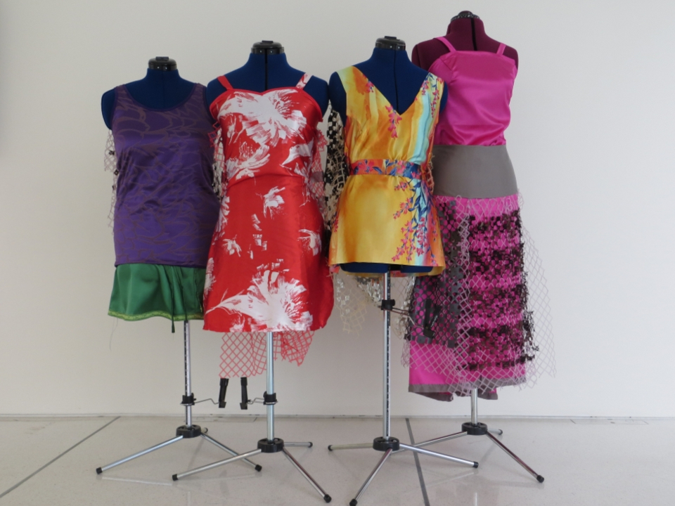
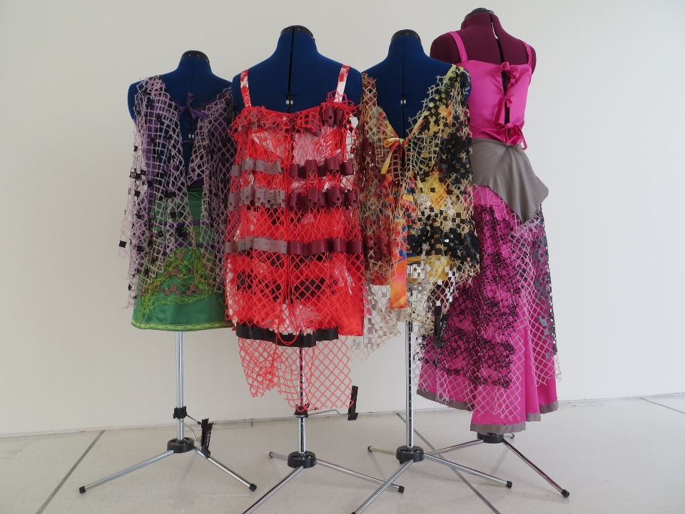
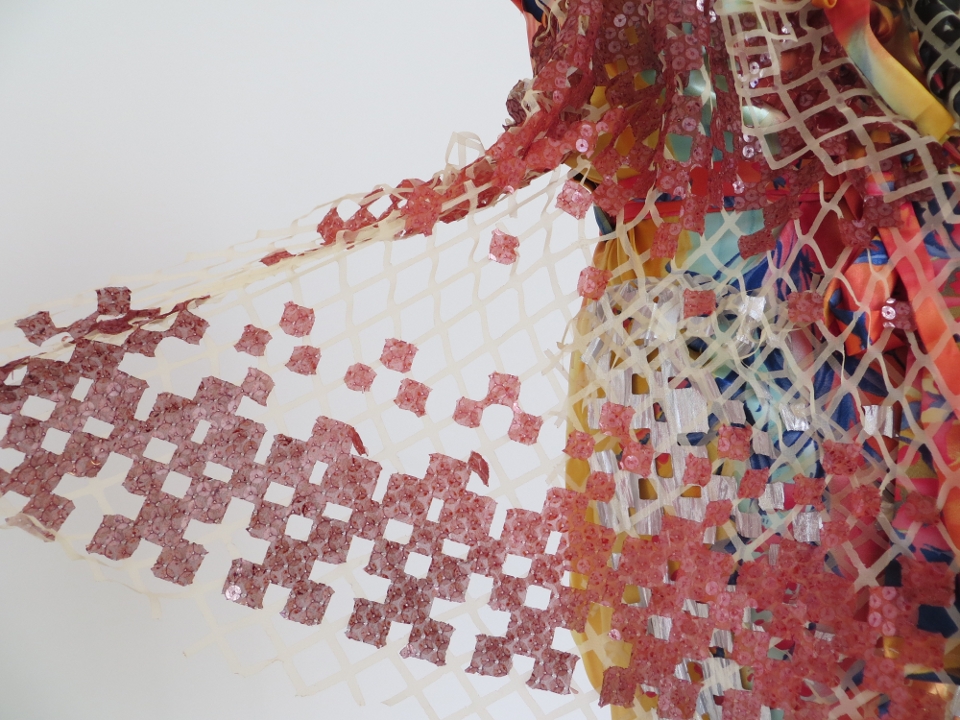
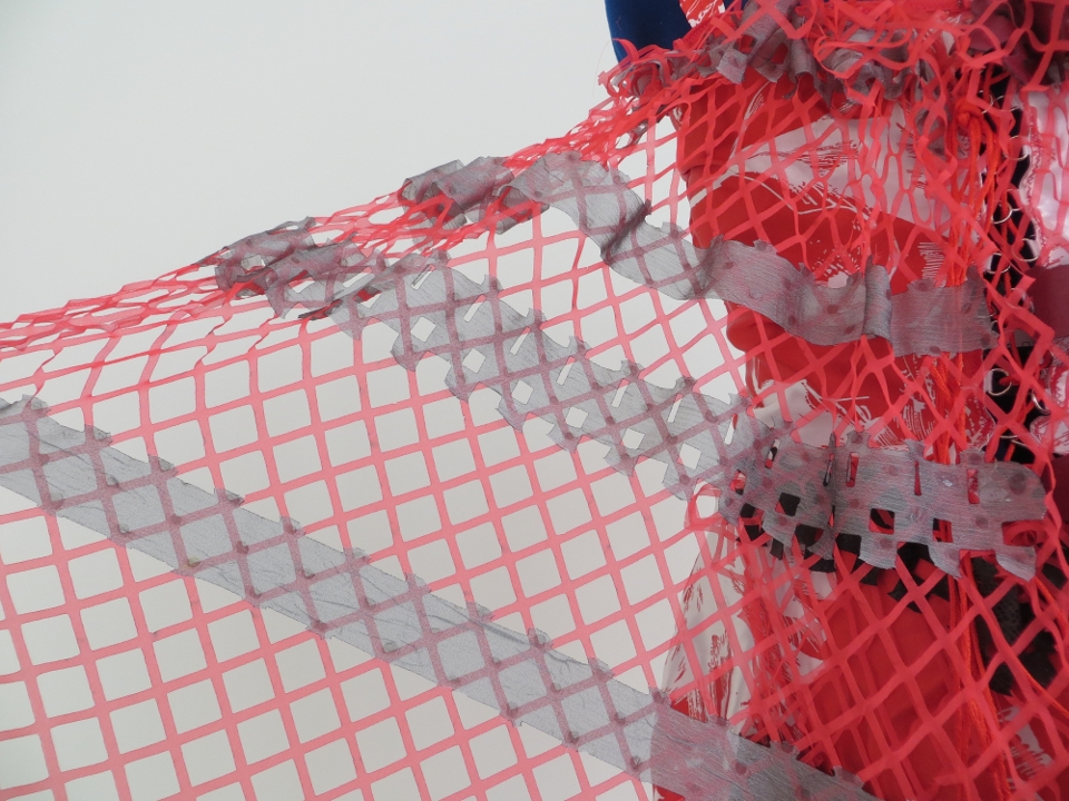
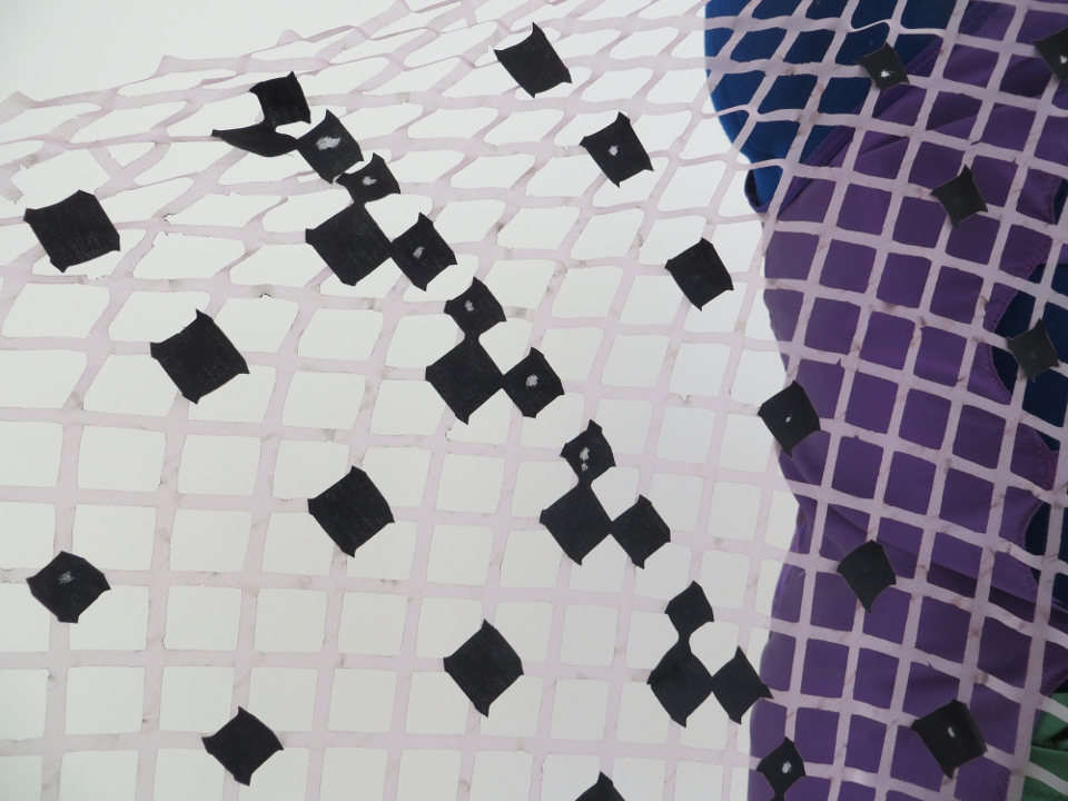
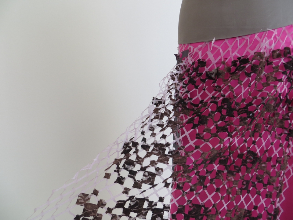
The final data physicalization, Dressed in Data, was a precursor to Data Shirts and explores more abstract representations of environmental health data. Indoor air pollutant data is represented through four outfits, each representing findings from a particular participant and chemical class. Each piece is computationally designed; an R script translates the data set into a lace image that can be laser cut in fabric. Key attributes of the data--as identified by prior research--are mapped to the lace pattern as follows:
- Number of chemicals detected: number of squares
- Relative amounts detected for chemicals: size of squares
- Potential chemical sources: fabric type and style
The images below display four garments representing chemicals detected in the home of one individual. The yellow garment shows industrial chemicals, red shows phthalates and plastics, purple shows pesticides, and pink shows metals.