Data memes
with Meryl Alper and Corey Cleveland
Data Memes explores how communities creatively remix visualizations to grapple with global issues. The COVID-19 pandemic brought an abundance of data visualizations into the public sphere, as well as an opportunity to understand how communities engage with this information. Many memes around COVID-19 included data visualization language and demonstrated how creativity might be part of active community sense-making around data of global importance.
Our findings support the idea that emotionally engaged practices may be important to designing data displays with a general audience around issues of global importance. They also demonstrate the many ways that the lines between formal and informal information visualization practices have blurred, both making visible the norms and values in "traditional" data visualization and providing an opportunity to explore alternative approaches. You can see our full paper here:
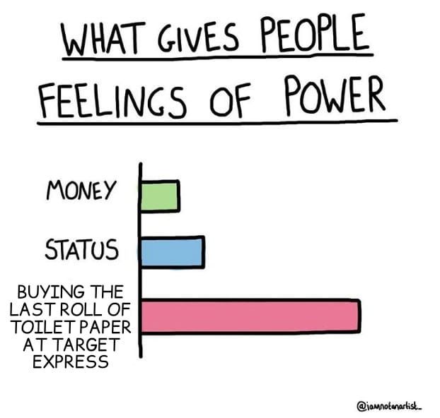
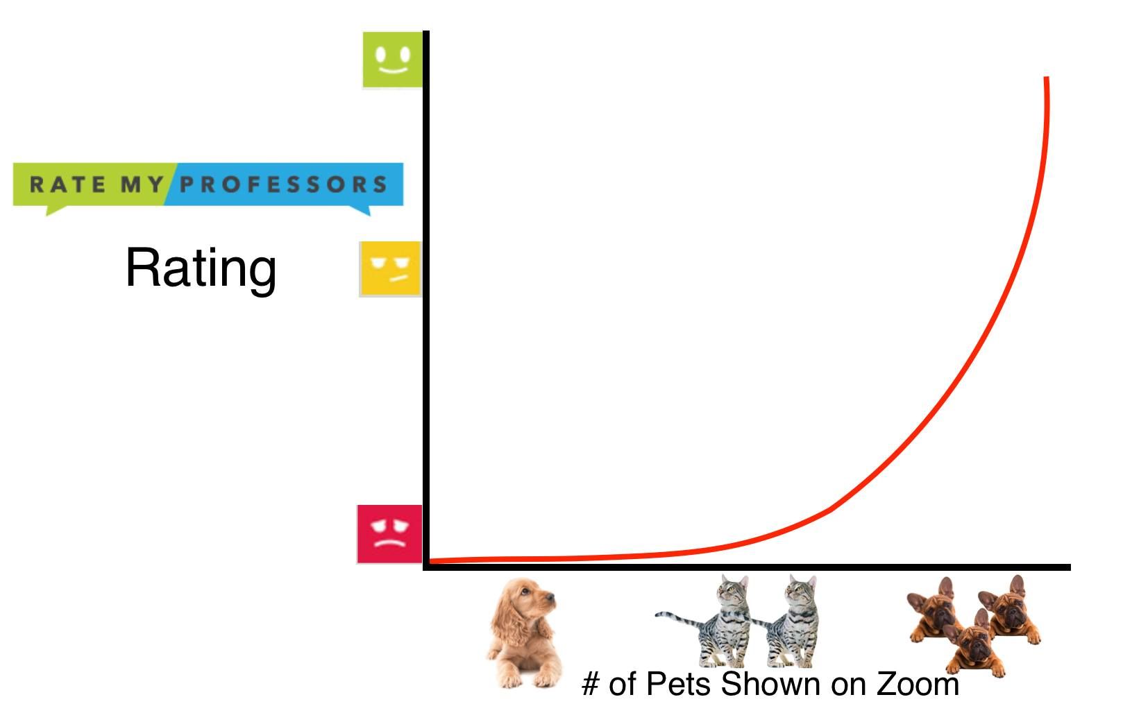
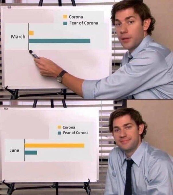
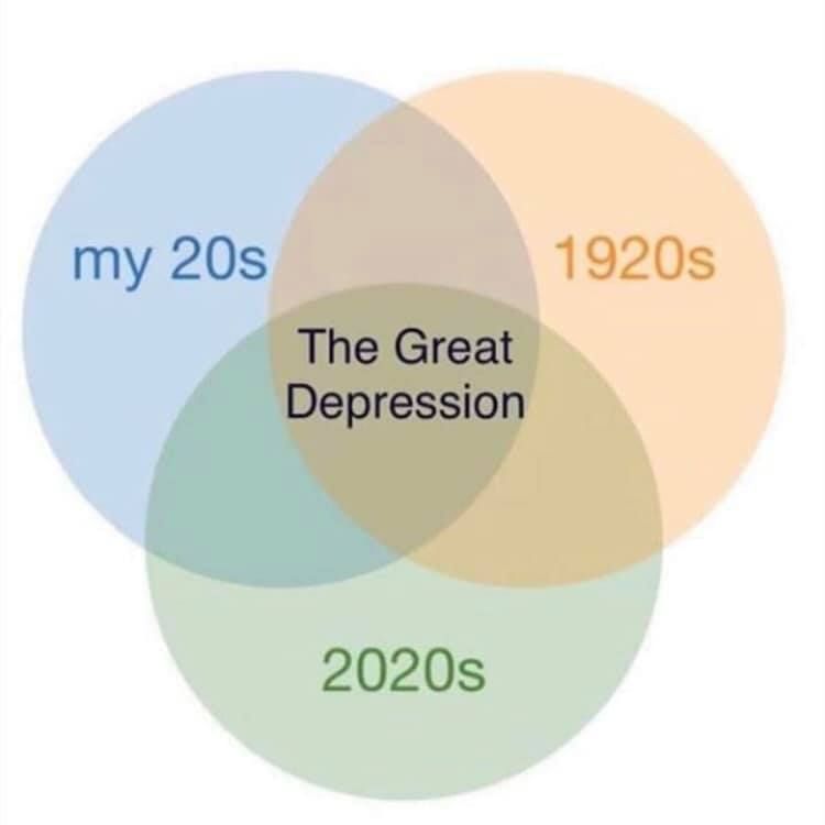
The memes from Zoom Memes for Self Quaranteens surfaced four main approaches to integrating data visualization language into memes: (1) augmenting plots with emotion or other interpretation, (2) visualization as a coarse indicator, (3) timely common plots as visual analogy, (4) visual puns. The integration of emotion and commentary into visualizations is a particular notable strategy in the context of global issues, where collective sensing-making may play an important role in creating action. Examples of these memes are included below and our full data set can be found at coviddatamemes.com.